Fixed-theme Bootstrap Navbars
Last update: April 1, 2026
When this article was written, the version 5.3 of Bootstrap was used. Some or all of the information in this article may not apply to other versions.
Introduction
Bootstrap provides a Navbar component that is a navigation header. Typically, the Navbar contains:
- branding text and/or a logo that identifies the company or website
- navigation links to major sections of the website
- additional links or settings such as a GitHub repo link or color theme selector
Both the Bootstrap and React Bootstrap sites sport
Navbars with a fixed color theme. That is, colors used by the Navbar stay the same regardless of whether color theme of
the overall site is set to light or dark mode.
In case you are unfamiliar with the dark mode support provided by Bootstrap, see the Color modes section of the official Bootstrap documentation.
For me, it was far from obvious how one would reproduce this kind of behavior for one's own website when using Bootstrap. In this article, I'll detail what worked for me and any insights that I thought were particularly interesting.
Baseline Behavior of Bootstrap Navbars
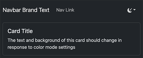
By default, with regard to colors, Bootstrap Navbars behave very similarly to elements that would typically appear in the main element of a website, such as Cards.
More specifically, when the site has a light theme, the Navbar has a light background and dark text.
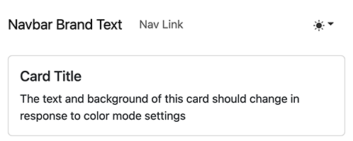
When the site has a dark theme, the Navbar has a dark background and light text.
Setting the Navbar to Use a Fixed Background Color
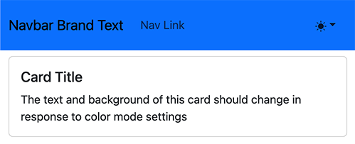
Let's attempt to replicate the design of the Bootstrap and React Bootstrap sites. Those sites have a relatively dark, fixed, background color for the Navbar. We can start off by setting the background color of the Navbar to one of the theme colors.
For React Bootstrap, we can use the bg prop of Navbar. Alternatively, we can a utility class like bg-primary,
which can be used regardless of whether we are using React Bootstrap.
Below is a code snippet of applying the primary theme color to the Navbar component of React Bootstrap.
<Navbar bg="primary">
{
    // NavBar contents...
}
</Navbar>
Upon making this change, we can observe that in light mode, the text is dark over the newly added dark background, posing issues with contrast.
Setting the Navbar to Always Use the Dark Theme
Given that the background is relatively dark, one can follow an example in the
color schemes section of the Bootstrap
documentation. Setting the color mode of the Navbar to dark with the data-bs-theme property solves problem mostly.
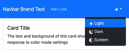
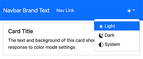
While setting the dark theme on the Navbar makes it look much better with a dark background color, some issues still remain:
- the dropdown menu is fixed to the
darktheme even if the rest of the site is on thelighttheme. The official Bootstrap site has the menu using the same theme as the rest of the site. - the navigation link and dropdown menu icon color is designed for a darker background and doesn't contrast well enough with the primary color background to pass accessibility guidelines.
Custom CSS Solution
Given the issues encountered with setting the data-bs-theme property on the Navbar element to dark, one might
examine the official Bootstrap to site to see how their solution works. It turns out that their solution is to use
custom CSS that is not part of the official release to style the Navbar.
Examining the Bootstrap code repo, it turns out that there is an SCSS file dedicated to styling the Navbar. We can adopt the sections of the file that apply to our use case.
style.scss
The following CSS rules are adapted from Bootstrap's official documentation site. .navbar-brand and .nav-link are
CSS classes provided by Bootstrap to style the Navbar brand and links, respectively. The class at the top of the
snippet, .custom-navbar, is specific to this snippet and should be added to the nav element the represents the
Navbar. The rules in this snippet are
more specific than the rules provided by
Bootstrap itself and end up overriding the default behavior of Bootstrap.
// other rules...

.custom-navbar {
  @media (forced-colors) {
    background-color: Canvas;
  }

  .navbar-brand {
    color: $white;
  }

  .nav-link {
    color: rgba($white, .85);

    &:hover,
    &:focus {
      color: $white;
    }

    &.active {
      font-weight: 600;
      color: $white;
    }
  }
}
Applying the Solution
We can apply the adapated CSS rules by adding the custom-navbar class to the Navbar's root nav element. The
previously added data-bs-theme attribute is no longer needed and should be removed for the dropdown menu to obey
changes in the site-wide color theme.
The following code snippet shows what the React Bootstrap's Navbar prop looks like when applying the rules.
<Navbar bg="primary" className="custom-navbar">
{
    // NavBar contents...
}
</Navbar>
Upon making those changes, we can see that the dropdown menu is using the light theme when the entire site is set to
light. The CSS rules also made it so that links and brand are brighter, improving contrast.
Finishing Touches
Even with the brighter colors set by the custom CSS rules, the contrast ratio of text to background for the Navbar does not meet the recommended 4.5:1 contrast ratio for accessibility.
One way to meet the recommended ratio is to use a darker background color for the Navbar. Bootstrap provides predefined increments of darkness for various colors as SCSS variables.
In this case, setting the color to be one increment darker than the default blue primary color will solve our contrast ratio problems. To do so, we can add a rule to the SCSS snippet as follows:
.custom-navbar {
  background-color: $blue-600;

  // rest of SCSS rules...
}
Since the background color of the Navbar is now set by CSS directly, there is no longer a need to specify in the
Navbar component's bg prop:
<Navbar className="custom-navbar">
{
    // NavBar contents...
}
</Navbar>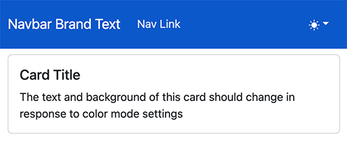
Closing Thoughts
The amount of effort needed to achieve a Navbar that mimics the style of Bootstrap's official documentation site may indicate that this an area ripe for improvement in an upcoming version of Boostrap. Given that dark mode is only relatively recently well-supported by Bootstrap, this finding is not too surprising.
Source Code
For brevity, many of the implementation details of the project were left out. To see the entirety of the project used to demonstrate the concepts explored in the article, go the navbar branch of a Next.js and dark mode demo project. The project was also used in the Dark Mode with Next.js and Bootstrap article.
Discussion
If you have questions or comments about:
- things I may have missed
- things I got wrong
- better ways of doing things
feel free to post in the discussion section of the repo for this site on GitHub.