Dark Mode with Next.js and Bootstrap
Last update: April 1, 2026
Introduction
These days, one may commonly see three color settings offered by modern websites: a light color mode, a dark color mode, and a "sync to system"-type setting that obeys the setting of the underlying OS.
One might classify React apps into two major categories these days:
- Single Page Applications (SPAs) without Server-Side Rendering (SSR) with a framework like Vite
- Next.js apps with a mixture of server and client components
Between these two, SPAs are almost certainly easier to think about. It turns out, however, that even for a traditional SPA, implementing a toggleable dark mode may end up being surprisingly challenging.
What to Expect from This Article
This article will start off by describing a three-setting dark mode solution for a Vite SPA before moving onto the more challenging task of implementing a solution that works with Next.js, SSR, and a mixture of server and client components.
Note that both MUI (relevant documentation)
and the popular next-themes project offer a three-setting solution
for Next.js. MUI's solution is exclusively for MUI while next-themes can work for multiple design systems that depend on
an attribute set at the root html element, including Bootstrap.
The solution presented in this article mainly meant for educational purposes and does not claim to be better than either MUI's or next-theme's. However, this article does discuss an alternative solution not employed be either of them: the use of cookies as a way of avoiding hydration warnings and dark mode flash.
Vite SPA
Controlled Implementation Attempt
When in data mode, Bootstrap's dark mode is activated by setting the data-bs-theme attribute to dark. (See the
relevant documentation for more details.)
Therefore, an ideal solution to keep to React's paradigm of controlled components would be to implement conditional
rendering of this data-bs-theme attribute.
This approach is already questionable due to the root of a Vite SPA being a div inside the body tag. There will be
more on that later. In the meantime, let's continue with implementing this approach in the meantime for the sake of
learning.
Reading the System Preference
To implement the "system preference" option in addition to light and dark modes, the React app will need to be aware of the current preference as well as changes to it.
Browser JavaScript can determine this preference by calling the Window.matchMedia function on the prefers-color-scheme media feature. To listen for changes to the resulting MediaQueryList object, one can create an event listener for the change event.
React provides the useSyncExternalStore hook to subscribe to
event listeners and update components with new values in response to events. (Using useState and useEffect instead
is
subject to race conditions.)
A hook that performs that media query and keeps a React component up to date on changes to the to query result may be implemented as follows:
useSystemDarkPref.ts
import { useSyncExternalStore } from "react";

const darkModeQueryList = window.matchMedia("(prefers-color-scheme: dark)");

export default function useSystemDarkPref() {
  return useSyncExternalStore(subscribe, getSnapshot);
}

function getSnapshot() {
  return darkModeQueryList.matches;
}

function subscribe(
  callback: (this: MediaQueryList, ev: MediaQueryListEvent) => void,
) {
  darkModeQueryList.addEventListener("change", callback);
  return () => {
    darkModeQueryList.removeEventListener("change", callback);
  };
}
User Settings and the Effective Theme
As discussed earlier, the three settings that the user can choose are light, dark, and system. The
prefers-color-scheme: dark media query is used to determine whether the theme should effectively be light or
dark
if system is selected by the user.
These options may be defined as follows:
types.ts
export type ThemeOptionName = "light" | "dark" | "system";

export type EffectiveOptionName = Exclude<ThemeOptionName, "system">
Storing the User Setting in Local Storage
To remember the user's preference in between page refreshes and new tabs being opened, we can store the setting in
local storage in addition to a useState hook. The following functions can be used to read from and write to
local storage.
themeLs.ts
import type { ThemeOptionName } from "./types.ts";

export const THEME_LS_KEY = "theme";

export const getInitThemeOptionName: () => ThemeOptionName = () => {
  const lsValue = localStorage.getItem(THEME_LS_KEY);
  switch (lsValue) {
    case "light": {
      return "light";
    }
    case "dark": {
      return "dark";
    }
    default: {
      return "system";
    }
  }
};

export const setThemeOptionName = (name: ThemeOptionName) => {
  localStorage.setItem(THEME_LS_KEY, name);
};
Computing the Effective Setting
The result of the media query and the user's setting can be combined to compute the actual value of the data-bs-theme
attribute. Below is a hook for doing so:
useEffectiveTheme.ts
import type { EffectiveOptionName, ThemeOptionName } from "./types.ts";
import { useMemo } from "react";

const useEffectiveTheme: (
  optionName: ThemeOptionName,
  sysDarkPref: boolean,
) => EffectiveOptionName = (optionName, sysDarkPref) =>
  useMemo(() => {
    if (optionName === "light" || optionName === "dark") {
      return optionName;
    }

    return sysDarkPref ? "dark" : "light";
  }, [optionName, sysDarkPref]);

export default useEffectiveTheme;
Putting it Together
The following top-level component for a Vite app makes use of each of the previously discussed functions and type
definitions to implement dark mode switching in a controlled manner. React directly renders the main component
that contains the data-bs-theme property that controls the color theme for Bootstrap.
App.tsx
// imports...
function App() {
const systemDarkPref = useSystemDarkPref();
const [themeOptionName, setThemeOptionName] = useState(
getInitThemeOptionName(),
);
const effectiveTheme = useEffectiveTheme(themeOptionName, systemDarkPref);
return (
<main data-bs-theme={effectiveTheme}>
<Card>
<Card.Body>
<Card.Title>Card Title</Card.Title>
<Card.Text>
The text and background of this card should change in response to
color mode settings
</Card.Text>
</Card.Body>
</Card>
<ButtonGroup>
{Object.keys(themeOptionLabels).map((name) => (
<ToggleButton
key={name}
id={`radio-${name}`}
type="radio"
value={name}
name="theme-selector"
checked={themeOptionName === name}
onChange={() => {
setThemeOptionName(name as ThemeOptionName);
setLsThemeOptionName(name as ThemeOptionName);
}}
variant="outline-primary"
>
{themeOptionLabels[name as ThemeOptionName]}
</ToggleButton>
))}
</ButtonGroup>
</main>
);
}
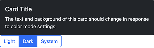
export default App;Screenshot
Dark mode works, but only for the portion of the site under the main tag. Notably, the background of the root html
is not set to dark mode. In the screenshot below, note the area with the light background despite the app being set to
dark mode.
Source Code
The source code of this example can be found in a GitHub repo.
Uncontrolled Implementation
As demonstrated in the Controlled Implementation Attempt, controlling the Boostrap
theme via the data-bs-theme attribute on an element that is a child of the root html element is usually less than
ideal. There may be a visual clash from there being two regions in the app: one in dark mode and one in light mode.
To make the dark mode setting work for the entire site, we will need to set the data-bs-theme attribute on the root
html element. Since the html is not being rendered by React, we will need to use an uncontrolled implementation.
Such an implementation can be done by using the
DOM to access the root element and set the
data-bs-theme attribute on it directly. This uncontrolled implementation is in contrast to the controlled
implementation
where a state and conditional rendering was used to set the attribute.
Separate Initialization Script
The roles of useSystemDarkPref.ts and useEffectiveTheme.ts will be
assumed by a separate script that runs before React renders. In addition to subscribing to the
prefers-color-scheme: dark media query and computing the effective theme, the script also:
- exposes a function to set the theme based on what is in local storage
- runs the function to set the initial
data-bs-themeattribute when the app first loads
The exposed function will later be called by the color mode selector UI component to actuate changes to the color mode.
dark-mode.js
"use strict";

const syncTheme = () => {
  let currentTheme = "system";
  const storedTheme = localStorage.getItem("theme");
  if (["dark", "light"].includes(storedTheme)) {
    currentTheme = storedTheme;
  }

  if (currentTheme === "system") {
    document.documentElement.setAttribute(
      "data-bs-theme",
      window.matchMedia("(prefers-color-scheme: dark)").matches
        ? "dark"
        : "light",
    );
  } else {
    document.documentElement.setAttribute("data-bs-theme", currentTheme);
  }
};

window
  .matchMedia("(prefers-color-scheme: dark)")
  .addEventListener("change", syncTheme);

syncTheme();

window.syncTheme = syncTheme;
This script was derived from the dark mode JavaScript example on the official Bootstrap documentation. Look at the example if you want additional insight into the reasoning behind the script.
React Component Changes
With this uncontrolled implementation, much of the logic has been extracted out of React components and hooks and into the separate initialization script. However, it is still necessary for the React component for setting the color mode to:
- read and display the currently selected mode
- update the selected mode by writing a value to local storage
- call the function exposed by the initialization script to sync up the
data-bs-themeattribute with the setting in local storage
The following App.tsx file has been modified from the controlled implementation version to implement those changes.
App.tsx
// imports...
function App() {
const [themeOptionName, setThemeOptionName] = useState(
getInitThemeOptionName(),
);
return (
<main>
<Card>
<Card.Body>
<Card.Title>Card Title</Card.Title>
<Card.Text>
The text and background of this card should change in response to
color mode settings
</Card.Text>
</Card.Body>
</Card>
<ButtonGroup>
{Object.keys(themeOptionLabels).map((name) => (
<ToggleButton
key={name}
id={`radio-${name}`}
type="radio"
value={name}
name="theme-selector"
checked={themeOptionName === name}
onChange={() => {
setThemeOptionName(name as ThemeOptionName);
setLsThemeOptionName(name as ThemeOptionName);
(
window as Window & typeof globalThis & { syncTheme: () => void }
).syncTheme();
}}
variant="outline-primary"
>
{themeOptionLabels[name as ThemeOptionName]}
</ToggleButton>
))}
</ButtonGroup>
</main>
);
}
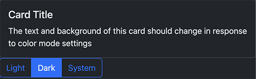
export default App;Screenshot
With this uncontrolled implementation in place, the data-bs-theme property is set on the root html element, causing
the background of the entire app to obey the dark mode setting.
Source Code
The source code of this example can be found in a side branch of a GitHub repo.
Bonus: Cross-tab Option Sync
Both MUI and next-themes support syncing settings changes across tabs automatically. If such a feature were not present, changing the dark mode setting in one tab for the same site will not affect other open tabs until those tabs are refreshed.
One way to implement such a feature is to use storage events as a way to communicate changes to the dark mode setting across tabs.
Note that this event is received by each tab except the one that made the change to local storage. The following sample implementation takes this fact into account. Also note that the following sample is based off the uncontrolled implementation.
Initialization Script Changes
The initialization script from the uncontrolled implementation requires an additional
event listener to respond to the storage event:
dark-mode.js
// rest of file...

window.addEventListener("storage", (event) => {
  if (event.key === THEME_LS_KEY) {
    syncTheme();
  }
})

// rest of file...
Listening to Stored Value Changes to Update the UI
The changes made so far cause the styling to sync properly but not the selection widget. To sync the selection widget, we need to attach another handler to listen to storage events. This handler is attached and detached via useSyncExternalStore.
useExtChangedLsValue.ts
import { useSyncExternalStore } from "react";
import { getThemeOptionName } from "./themeLs.ts";
import { THEME_LS_KEY } from "./models.ts";

const subscribe: (callback: () => void) => (() => void) = (callback) => {
  const wrappedCallback: (event: StorageEvent) => void = (event) => {
    if ((event as StorageEvent).key === THEME_LS_KEY) {
      callback();
    }
  };
  window.addEventListener("storage", wrappedCallback);
  return () => {
    window.removeEventListener("storage", wrappedCallback);
  };
};

const useExtChangedLsValue = () => (
  useSyncExternalStore(subscribe, getThemeOptionName)
);

export default useExtChangedLsValue;
Updating the UI
Actually updating the UI involves reading the value of the useExtChangedLsValue hook and then updating the component state with a useEffect hook.
App.tsx
// imports...

function App() {
  const [themeOptionName, setThemeOptionName] = useState(
    getThemeOptionName(),
  );
  const lsThemeOptionName = useExtChangedLsValue();
  useEffect(() => {
    setThemeOptionName(lsThemeOptionName);
  }, [lsThemeOptionName])

  return (
    // returned JSX...
  );
}

export default App;
Source Code
For the sake of brevity, not all changes made to the uncontrolled implementation were mentioned in this (cross-tab syncing) section. To see the entirety of the implementation, see the code sample on GitHub.
Next.js
Implementing dark mode with Bootstrap and Next.js can be done by adapting the uncontrolled solution for Vite described earlier.
For the sake of brevity, the solutions discussed in this section omit the cross-tab syncing functionality implemented for Vite. However, it should be quite possible to adapt that solution for Next.js with moderate effort.
Perhaps the greatest sticking point for dark mode with Next.js is preventing dark mode flash. Two solutions will be presented.
Script Injection Solution
This solution to dark mode flash is similar to the one used by MUI's InitColorSchemeScript component. While not particularly obvious from Next.js's documentation, it is possible to use the dangerouslySetInnerHTML prop for built-in React components to inject a script that runs before any content is visible.
The Initialization Script
The initialization script from the uncontrolled Vite solution can be used as is for Next.js as well.
Next.js offers a Script component for running external scripts. The initialization script can be configured to run
with that Script component and at the earliest possible moment with the
beforeInteractive loading strategy.
In addition, a small portion of that script, just enough to prevent dark mode flash, can be injected via the dangerouslySetInnerHTML prop to run even earlier.
layout.tsx
import type { Metadata } from "next";
import "./style.scss";
import Script from "next/script";

export const metadata: Metadata = {
  title: "ssr-dark-mode-example",
  description:
    "Educational sample code for dark mode with Next.js and Bootstrap",
};

const darkModeInitScript = `
  let currentTheme = "auto";
  const storedTheme = localStorage.getItem("theme");
  if (["dark", "light"].includes(storedTheme)) {
    currentTheme = storedTheme;
  }

  if (currentTheme === "auto") {
    document.documentElement.setAttribute(
      "data-bs-theme",
      window.matchMedia("(prefers-color-scheme: dark)").matches
        ? "dark"
        : "light",
    );
  } else {
    document.documentElement.setAttribute("data-bs-theme", currentTheme);
  }
`;

export default function RootLayout({
  children,
}: Readonly<{
  children: React.ReactNode;
}>) {
  return (
    <html lang="en" suppressHydrationWarning>
      <head>
        <script
          dangerouslySetInnerHTML={{ __html: darkModeInitScript }}
        ></script>
      </head>
      <body>
        <Script src="/dark-mode.js" strategy="beforeInteractive" />
        {children}
      </body>
    </html>
  );
}
The Theme Selector
Perhaps the biggest caveat of adapting the theme selection UI code from the Vite example is dealing with
DOM variables like window that only on the client. The UI
code involves accessing local storage as part of rendering the component to set the initial value of a useState hook.
For that reason, the UI code needs to imported dynamically with SSR disabled. A separate "container" component is used to do the dynamic import.
It may be possible to entirely avoid using dynamic imports and disabling SSR in this case. The changes to do so
would involve moving all references to client-only variables like localStorage into event listeners or useEffect
hooks. For this particular component, the reading of localStorage to set the UI state could be moved into a
useEffect hook.
ThemeSelector.tsx
import { FC, useState } from "react";
import ButtonGroup from "react-bootstrap/ButtonGroup";
import ToggleButton from "react-bootstrap/ToggleButton";
import { themeOptionLabels } from "@/app/models";
import {
  getThemeOptionName,
  setThemeOptionName as setLsThemeOptionName,
} from "@/app/themeLs";
import { ThemeOptionName } from "@/app/types";

const ThemeSelector: FC = () => {
  const [themeOptionName, setThemeOptionName] = useState(getThemeOptionName());

  return (
    <ButtonGroup>
      {Object.keys(themeOptionLabels).map((name) => (
        <ToggleButton
          key={name}
          id={`radio-${name}`}
          type="radio"
          value={name}
          name="theme-selector"
          checked={themeOptionName === name}
          onChange={() => {
            setThemeOptionName(name as ThemeOptionName);
            setLsThemeOptionName(name as ThemeOptionName);
            (
              window as Window & typeof globalThis & { syncTheme: () => void }
            ).syncTheme();
          }}
          variant="outline-primary"
        >
          {themeOptionLabels[name as ThemeOptionName]}
        </ToggleButton>
      ))}
    </ButtonGroup>
  );
}

export default ThemeSelector;
ThemeSelectorContainer.tsx
"use client";

import { FC } from "react";
import dynamic from "next/dynamic";

const ThemeSelector = dynamic(() => import("./ThemeSelector"), { ssr: false });

const ThemeSelectorContainer: FC = () => <ThemeSelector />;

export default ThemeSelectorContainer;
Source Code
The source code for this example may be found in a GitHub repo.
Cookie and Media Query Solution
If one wants to avoid using script injection via the dangerouslySetInnerHTML prop, it is possible to make use of a
combination of cookies and additional CSS to prevent dark mode flash.
Setting and Reading Cookies
Cookies can be used to store the user's preference in a way the Next.js server can read it while rendering server-side.
Based on the value in the cookie, the server can set the data-bs-theme attribute on the root html element for the
initial render. Subsequent changes to the attribute can be made via JavaScript once client-side JavaScript gets a
chance to run.
layout.tsx
The initial data-bs-theme attribute is now set server-side based on the value in the cookie.
In the case of the
system setting, the special system value for data-bs-theme will activate a special set of CSS for the sake of
preventing dark mode flash. JavaScript will later set the attribute to light or dark based on the media query
result.
// imports and Metadata...

const cookieStore = await cookies();
const theme = cookieStore.get("theme")?.value ?? "system";

export default function RootLayout({
  children,
}: Readonly<{
  children: React.ReactNode;
}>) {
  return (
    <html lang="en" data-bs-theme={theme} suppressHydrationWarning>
      <body>
        <Script src="/dark-mode.js" strategy="beforeInteractive" />
        {children}
      </body>
    </html>
  );
}
ThemeSelector.tsx
The onChange handler in the ThemeSelector component needs to updated to set the value of the cookie.
document.cookie = `theme=${name as ThemeOptionName}; path=/; max-age=31536000`;Custom CSS for the System Setting
As of version 5.3, Bootstrap only supports data attribute-based (data-bs-theme) or media query-based color modes in a
mutually exclusive manner. It is not possible to mix and match the types to implement the three-setting model that we've
been doing without using JavaScript. See the
relevant Bootstrap documentation for more
details.
This fact means that using the cookie-based approach to set the data-bs-theme attribute server-side only works for
circumstances where the user selects dark or light modes. For system mode, some solutions include:
- forking Bootstrap and modifying it to support media query and data modes simultaneously
- reimplementing portions of Bootstrap for a special value of
data-bs-themewith a media query
The following changes demonstrate option 2. The CSS only needs to prevent dark mode flash for the period of time before client-side JavaScript has a chance to execute. Hopefully, depending on how many features with Bootstrap are being used, it may only be necessary to reimplement a small portion of Bootstrap CSS.
style.css
When Bootstrap CSS encounters an unspecified data-bs-theme value, system in this case, Bootstrap defaults to using
the light theme. The following rules reimplement a subset of the dark theme rules. They will be used on the client
in the short period of time before JavaScript has a chance to run if:
- the site color theme preference is
system - the OS color theme preference is
dark
@media (prefers-color-scheme: dark) {
  :root[data-bs-theme="system"] {
    --bs-body-color: #{$body-color-dark};
    --bs-body-bg: #{$body-bg-dark};
    --bs-link-color: #{$link-color-dark};
    --bs-code-color: #{$code-color-dark};
    --bs-link-color-rgb: #{to-rgb($link-color-dark)};
    --bs-navbar-brand-color: #{$navbar-dark-brand-color};
    --bs-emphasis-color: #{$body-emphasis-color-dark};
    --bs-emphasis-color-rgb: #{to-rgb($body-emphasis-color-dark)};
    --bs-border-color: #{$border-color-dark};
  }
}
With these changes implemented, dark mode flash should no longer occur, at least for sample project. Additional rules may be necessary if a project contains Bootstrap components not covered by this SCSS snippet.
Source Code
The source code for this cookie-based solution is available in separate branch of the ssr-dark-mode-sample GitHub repo.
Discussion
If you have questions or comments about:
- things I may have missed
- things I got wrong
- better ways of doing things
feel free to post in the relevant discussion section on GitHub.