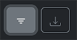
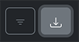
Toolbar
The toolbar is a <div> that contains buttons for accessing interfaces that take up a considerable amount of screen
space and are therefore not always displayed. Currently, one can access the interfaces for
filtering rows and exporting grid contents via the toolbar.
Live Demo
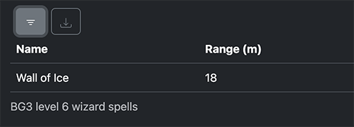
In the live demo below, the toolbar is located right above the grid. Click on the buttons on the toolbar to access the filtering and exporting interfaces. Hover over each button to see the label for the button.
To close an open interface, click on the button on the related button toolbar again. (For example, if the filtering options interface is open, you can close it by clicking on the filtering button on the toolbar.)
| Name | Range (m) | School |
|---|---|---|
| Arcane Gate | 18 | Conjuration |
| Chain Lightning | 18 | Evocation |
| Circle of Death | 18 | Necromancy |
| Create Undead | 3 | Necromancy |
| Disintegrate | 9 | Evocation |
Getting Started
Enable the toolbar by passing true to the useToolbar prop to the Grid component:
<Grid rows={rows} cols={cols} useToolbar />To allow the user to access the filtering interface on the toolbar, enable filtering on the grid:
<Grid
    rows={rows}
    cols={cols}
    useToolbar
    pagination={{ type: "uncontrolled" }}
/>
See the filtering documentation for more details on enabling filtering for a grid.
Features
The toolbar is design to provide access to multiple features via icon buttons that show and hide the interface for each feature. The table below describes the features that are currently available.
| Feature | Icon | Description |
|---|---|---|
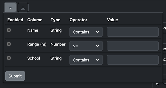
| Filtering | Opens the row filtering interface. If the toolbar is not enabled for a grid but filtering is enabled, the interface is still accessible via a separate button labelledFilter Options Table. See the filtering documentation for live examples of this button. If the toolbar is enabled for a grid but filtering is disabled, this button will not be displayed on the toolbar. | |
| Export | Opens the export interface. There is currently no way to access this interface other than through the toolbar. There is currently no way to remove access to this interface other than by disabling the toolbar. |
Keyboard Navigation
Accessibility
For the sake of accessibility, react-bootstrap-data-grid implements keyboard navigation according to the MDN documentation on the ARIA toolbar role.
In summary:
- For each toolbar, only one button is accessible via the Tab key at any one time. This behavior is implemented by dynamically setting the tabindex HTML attribute on each button.
- Once the browser is focused on a button within a toolbar, the user can focus on other buttons in the toolbar by pressing the Right Arrow and Left Arrow keys.
Accessing Features
Once the user is focused on an button within a toolbar, they can use the keyboard key for pressing buttons, usually Space or Enter, to access to show the interface for that feature.
Once the interface for a feature is displayed, the user can access the form elements of the feature by pressing Tab (or Shift + Tab to go in the other direction) to cycle-through tab-accessible elements on the page.
To close the feature's interface with the keyboard, the user needs to either:
- Focus on the button related to open interface and press the button again (usually with Space or Enter).
- Focus on the button related to open interface, use the arrow keys to switch to a different button, and press that button. For example, opening up the export interface while the filtering interface is open will close the filtering interface.
Visual Walkthrough
Below is a step-by-step demonstration of how keyboard navigation works along with screenshots for each step. It possible to follow along with this walkthrough using the live demo above.
Pressing Tab (forward direction) or Shift + Tab (backwards direction) cycles through tab-accessible elements on a page. Once a button in a toolbar is focused this way, the button is highlighted in a manner similar to the left button the below screenshot:
Pressing the Right Arrow key will move focus to the next button on the right, the export button.
Since the export button is the right-most button, pressing the Right Arrow key will cause the selection to wrap around back to the beginning. Pressing the Left Arrow will cause the focus to the button to the left. In either case, the focus moves back to the filtering button.
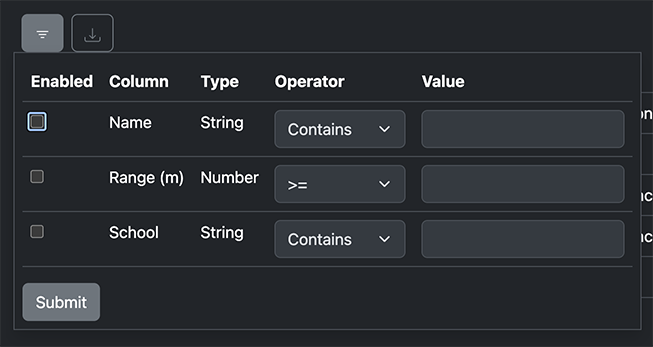
Pressing the Space or Enter key will open the filtering interface but will leave focus on the toolbar button.
Pressing Tab at this point will cause the browser to start cycling through form elements of the filtering interface. Disabled form elements are not focusable this way.
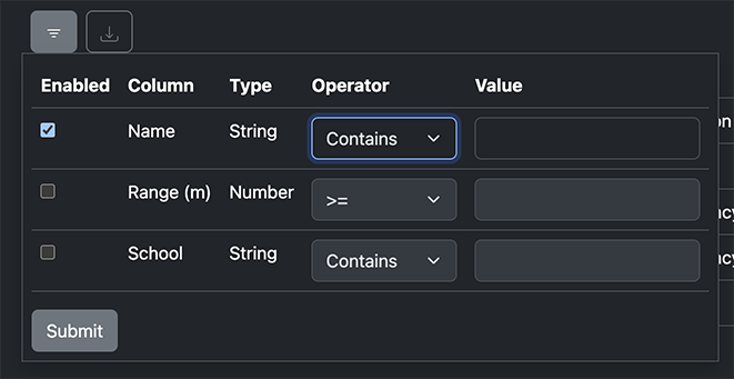
Pressing Space to check a focused checkbox will cause form fields in the same column to be enabled.
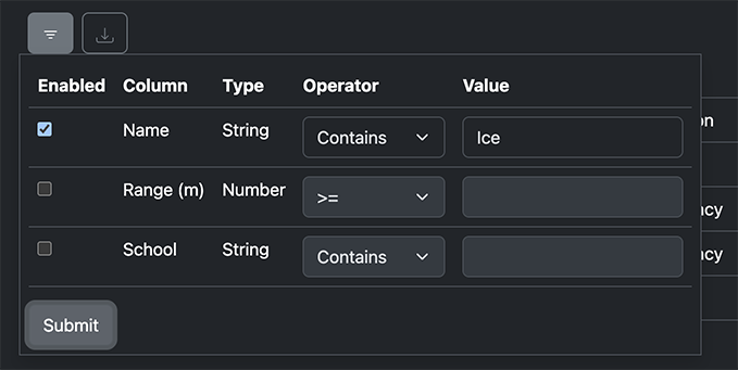
Pressing Tab one or more times will focus on form elements in the row before moving onto other elements in the form.
One can cycle through elements with Tab or Shift + Tab to make changes. Once one is ready to submit changes, one can use the Tab key to focus the submit button and press Space or Enter to submit the changes.
After submitting the changes, one can close the interface by using Shift + Tab to move back to the toolbar button for filtering and pressing Space or Enter.